Project: Considering the time restrictions I had I was happy to be able to present at the specified time. On the other hand, I am quite disappointed in myself for not being able to have a more resolved design. I was also disappointed I did not include some computer renders for my presentation... this is one thing I must learn how to do better over the mid-year break. I got some good constructive feedback at the presentation which was helpful; 1) strong concept... should have developed this through better & 2) missed a step from concept to design.... which could have been resolved better. I have taken this on board and appreciate that I should of really developed my initial concept better, as I myself also liked it. It was all about the reflectivity of the cbd buildings and the views in eachother that they produce (which I got from doing the Walkshop earlier in the semester & which also helped to produce my folie concept). Also, I was quite impressed with many of my fellow students work... many students had a well resolved library & showed much growth of design skill which was inspirational to see.
Unit: This unit has been quite demanding but in saying that, I have also learnt a lot in the process. My favourite project of the unit was by far the Folie. I found it the most interesting and practical. However, I found the second collaborative project quite demanding but I learnt some more skills for communicating in diverse groups which was useful and also started to use Skype as a reliable communication tool to connect with our overseas team mates. Although I was happy with where my third project was going, it would have been good to allow more time to resolve it further, as mentioned above. Overall, this semester's design work has at times pushed me out of my comfort zone, especially during the second project. In hindsight these where the times that I performed better and learnt the most.
Brisbane's historic & decaying Howard Smith Warves, provides an ideal location for design experimentation.
Thursday, 16 June 2011
INTERIOR PERSPECTIVES
The following hand drawings are of some of the main areas within the library. Although they try to communicate how the spaces would be used be users, they did not come out as well as I would have like. Next time I will definitely try to computer render these as I feel they lack a certain depth that would have been better expressed and shown through a computer rendering process.
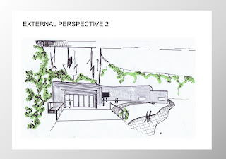
EXTERIOR PERSPECTIVES
Below are two external perspectives (hand drawn) of the library in its surround. Perspective one is viewed from above and the second perspective is drawn as if one was walking toward the entry. These drawings provide more of a realistic image of what people would see on approach to the site.
ELEVATIONS
The following images are the two main elevations that people will see on approach to the library. Both hand drawn, the west elevation shows how vivid the facade would be and how the projected facade would cloak the 'hard' building form.
Monday, 13 June 2011
SITE PLAN & FLOOR PLAN
Below is my final site plan showing the library form and location and my floor plan.
(As described in one of my bubble diagrams, positions of the rooms are located closer to the entry if they involve short activites). The staggered form represents the growth one develops when they're voice is heard. The form wraps around the central courtyard/theatre which represents the welcoming aspect the library has to all.
DRAFT FLOOR PLAN LAYOUT
The following are some sketches of the draft floor plan and form of my library. I wanted to continue to use the interactive technology that was chosen in project 2 so the facade needed to remain plain as the projectors will still be used to project images onto the facade. However, I wanted to simplify the form so as not to overwhelm the site especially since it is right next to the Storey Bridge.
Subscribe to:
Comments (Atom)


